This module's assignment called to generate visualizations from Dr. Piwek's posting on Tufte and Minard in R.
I had difficulty with installing and loading the list of packages all at once, and decided to load them on a case-by-case basis as they were used throughout the script.
It was interesting to see how the author created the visualizations based on a similar aesthetic accross many different toolsets (base R, lattice, ggplot2, etc.)
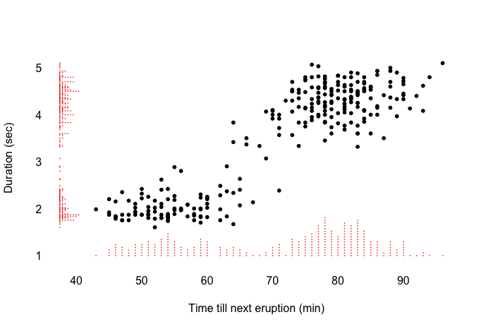
Marginal histogram scatter plot (base graphics with fancyaxis)
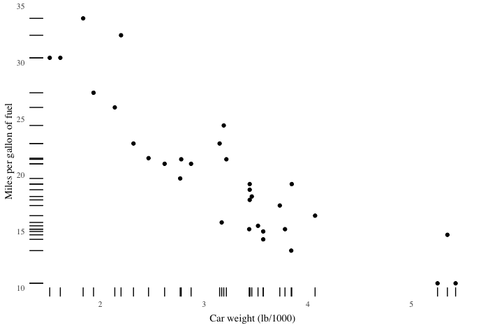
Dot-dash plot in ggplot2
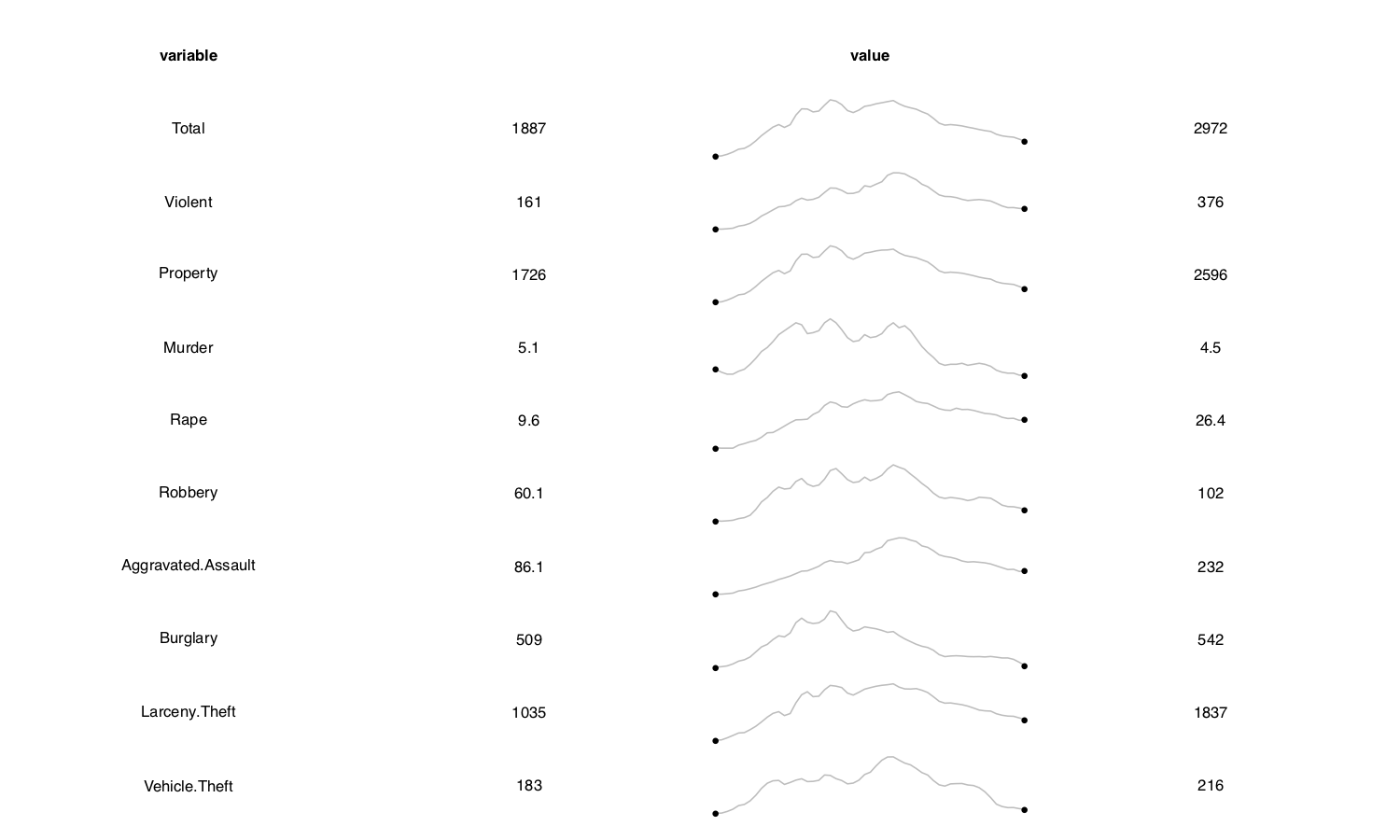
Sparklines in base graphics with plotSparklineTable
  ############################################################################
  # ------ ------ ----- MOD11: Minard and Tufte Work in R ----- ------ ------
  ############################################################################
  #' ---
  #' title:   "MOD11: Minard and Tufte Work in R"
  #' author:  "Kevin Hitt"
  #' date:    "Due: April 6th, 2020"
  #' ---
  #'

  # Load packages
  library(ggplot2)
  library(ggthemes)
  library(devtools)
  library(epanetReader)
  library(reshape)
  library(RCurl)
  source_url("https://raw.githubusercontent.com/sjmurdoch/fancyaxis/master/fancyaxis.R")

  # Plots derived from: http://motioninsocial.com/tufte/#introduction

  # i. Marginal histogram scatter plot (base graphics with fancyaxis)
  #     uses 'source_url' as defined with packages

  x <- faithful$waiting
  y <- faithful$eruptions
  plot(x, y, main="", axes=FALSE, pch=16, cex=0.8,
       xlab="Time till next eruption (min)", ylab="Duration (sec)",
       xlim=c(min(x)/1.1, max(x)), ylim=c(min(y)/1.5, max(y)))
  axis(1, tick=F)
  axis(2, tick=F, las=2)
  axisstripchart(faithful$waiting, 1)
  axisstripchart(faithful$eruptions, 2)

  # ii. Dot-dash plot in ggplot2

  ggplot(mtcars, aes(wt, mpg)) + geom_point() + geom_rug() + theme_tufte(ticks=F) +
    xlab("Car weight (lb/1000)") + ylab("Miles per gallon of fuel") +
    theme(axis.title.x = element_text(vjust=-0.5), axis.title.y = element_text(vjust=1))

  # iii. Sparklines in base graphics with plotSparklineTable

  dd <- read.csv(text = getURL("https://gist.githubusercontent.com/GeekOnAcid/da022affd36310c96cd4/raw/9c2ac2b033979fcf14a8d9b2e3e390a4bcc6f0e3/us_nr_of_crimes_1960_2014.csv"))
  d <- melt(dd[,c(2:11)])
  pdf("sparklines_base_epanetReader.pdf", height=6, width=10)
  plotSparklineTable(d, row.var = 'variable', col.vars = 'value')
  dev.off()