This module's assignment called to work with time series data and visual analysis. Several examples below were provided to follow along and consider with this week's reading material.
The script and plot examples are below, followed by their respective commentary.
Hot Dog Plot 1 (base R)
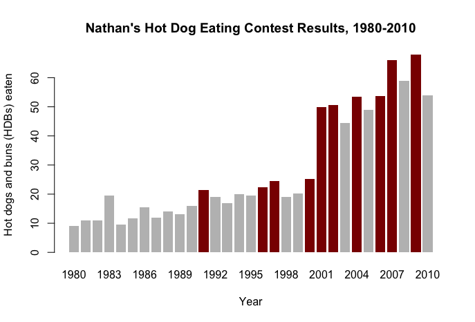
This plot conditionally fills the bar color if a new record was made in the competition that year. This visualization clearly shows the trend of competition winners with a helpful, additional dimension for record breakers.
Hot Dog Plot 2 (ggplot2)
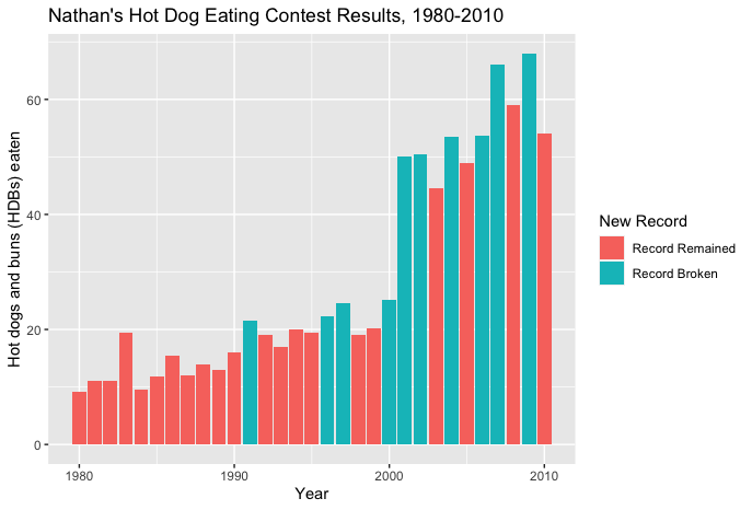
This plots displays the same data with alternative formatting in ggplot2. A helpful difference from the previous plot is the addition of the legend, which I was able to manually notate with semantic labels. One aspect that I consider a disadvantage is the color scheme, the base R plot before this one more clearly distinguishes the record breakers.
Hot Dog Plot 3 (base R)
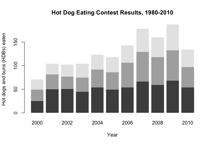
This stacked bar plot is effective in visualizing the top 3 competitors of each year's competition. It provides a more granular and detailed view than the previous plots, however, this comes with two costs:
- No labeled context that the stacked bars indicate the top 3 winners
- No distinction of years where a record was broken.
Economics Plot 1
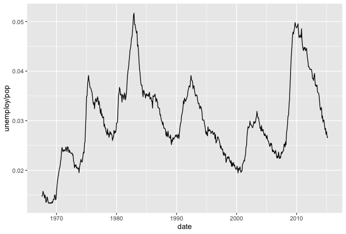
This line graph time series of the economics data shows how unemployment / population varies over time. This is effective in the sense that a large data set was brought into a more manageable scope, however, it would be useful to add a trend line to show whether the unemployment / population rate has an upward or downard tendency, given its high variability.
Economics Plot 2
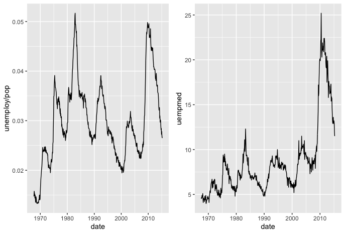
Here, the median duration of unemployment is facetted onto the previous plot, with an identical x-axis. This is useful as a comparison, however, a more effective method would have been to overlap the line graphs into a single plot. This would give more insight into whether the two variables have a similar cycle or interval of change.
Economics Plot 3
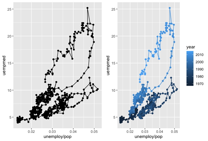
Here, observations are connected with a path line given their original order. This creates an interesting visualization of how unemployment / population varies with the median duration of unemployment. What I find most notable with this visualization is the addition of the year color scale in the right-hand plot. This helps to more clearly see the additional time dimension and show trends that are not visible in the left-hand plot. It seems that the year, unemployment, and duration all have a positive association - as one grows, so do the others.
Economics Plot 4
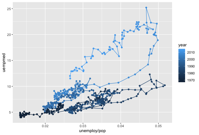
This final visualization is a subset of the previous plot, with just the right-hand side graph. This makes it easier to read without having to compare it with the left-hand plot which had only the difference of not including a color scale for year. I consider this the most potent of all the time series visualizations for a few reasons:
- The time series does not have time on the x-axis, but still manages to clearly show how time progression relates to the other variables.
- There is an actionable message included in the graph's story, my interpretation is that: as unemployment / population rises, so does the median duration of unemployment, and both of these have increased over time from 1970 - 2010.
  ############################################################################
  # ------ ------  MOD10: Time Series Trends and Visual Analysis ------ ------
  ############################################################################
  #' ---
  #' title:   "MOD10: Time Series Trends and Visual Analysis"
  #' author:  "Kevin Hitt"
  #' date:    "Due: March 30th, 2020"
  #' ---

  library(ggplot2)
  library(gridExtra)

  ## Hot Dog Plot 1 (base R)
  hotdogs <- read.csv("http://datasets.flowingdata.com/hot-dog-contest-winners.csv")
  colors <- ifelse(hotdogs$New.record == 1, "darkred", "grey")

  barplot(hotdogs$Dogs.eaten,
          names.arg = hotdogs$Year,
          col=colors,
          border=NA,
          main = "Nathan's Hot Dog Eating Contest Results, 1980-2010",
          xlab="Year",
          ylab="Hot dogs and buns (HDBs) eaten")

  ## Hot Dog Plot 2 (ggplot2)
  ggplot(hotdogs) +
    geom_bar(aes(x=Year, y=Dogs.eaten, fill=factor(New.record)), stat="identity") +
    labs(title="Nathan's Hot Dog Eating Contest Results, 1980-2010", fill="New Record") +
    xlab("Year") +
    ylab("Hot dogs and buns (HDBs) eaten") +
    scale_fill_discrete(name="New Record",
                      labels=c("Record Remained", "Record Broken"))

  ## Hot Dog Plot 3 (ggplot2)
  hotdog_places <- read.csv("http://datasets.flowingdata.com/hot-dog-places.csv",
                            sep = ",",
                            header = T)

  hotdog_places <- as.matrix(hotdog_places)

  #Rename the columns to correspond to the years 2000-2010
  #instead of names(hotdog_places) <- c("2000", "2001", "2002", ...
  colnames(hotdog_places) <- lapply(2000:2010, as.character)

  barplot(hotdog_places,
          border=NA,
          main="Hot Dog Eating Contest Results, 1980-2010",
          xlab="Year",
          ylab="Hot dogs and buns (HDBs) eaten")

  ## Economics Plot 1
  data(economics)
  force(economics)

  # create function to create year column
  year <- function(x) as.POSIXlt(x)$year + 1900
  economics$year <- year(economics$date)

  plot1 <- qplot(date, unemploy / pop, data = economics, geom = "line")
  plot1

  ## Economics Plot 2
  plot2 <- qplot(date, uempmed, data = economics, geom = "line")
  grid.arrange(plot1, plot2, ncol=2)

  ## Economics Plot 3
  plot1 <- qplot(unemploy/pop, uempmed, data = economics, geom = c("point", "path"))
  plot2 <- qplot(unemploy/pop, uempmed, data = economics, geom = c("point", "path"), color=year)
  grid.arrange(plot1, plot2, ncol=2)

  ## Economics Plot 4
  plot2