These visuals are based on the Monthly Modal Time Series data
from the US Department of Transportation. The assignment called to download a pre-cleaned version of this data and import it into Tableau for
visual representation and analysis. The following visualizations below were produced:
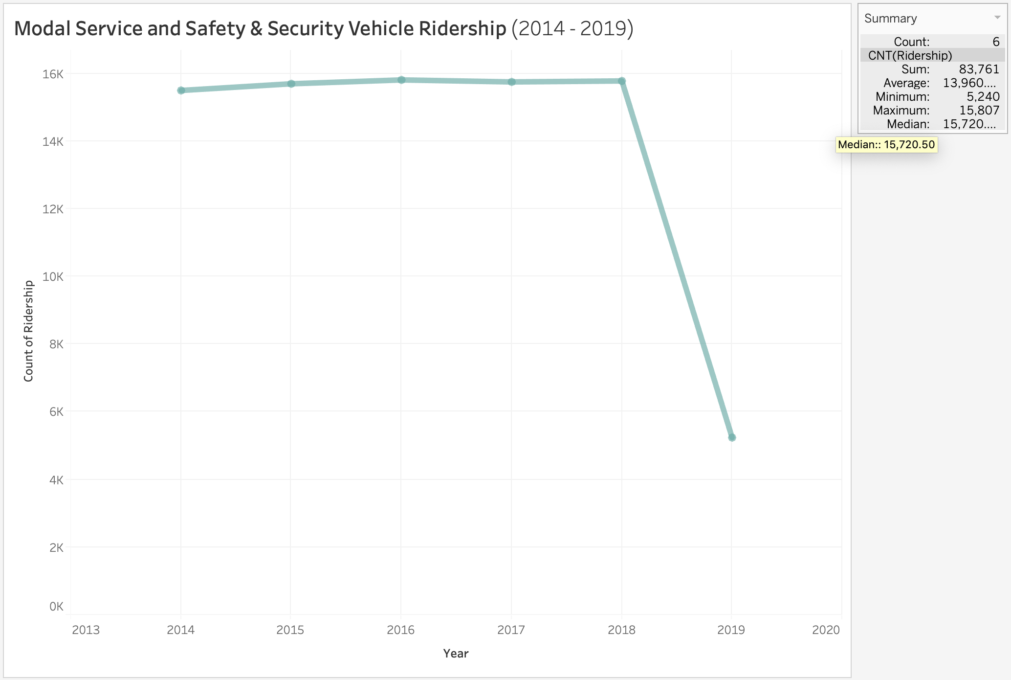
Ridership
This visual is a simple line graph displaying the count of ridership values for the given time frame. There is a dramatic decrease in the count from 2018 to 2019. The summary from Tableau on the right panel is useful to know the exact number of the highest and lowest values (5,240 and 15,807) without using a tooltip.
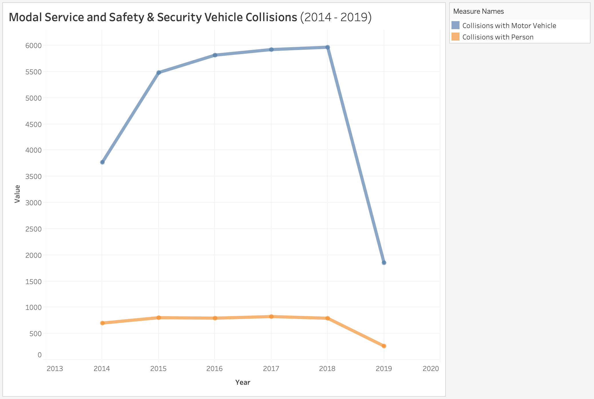
Collisions
This visual compares the count of collisions with vehicles vs. pedestrians. The difference in magnitude is clear to interpret, however, the location data provided is not being utilized and can include more detail.
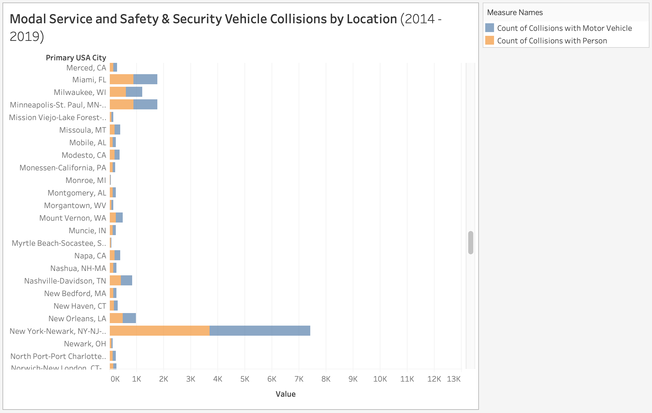
Collisions by Location
My first attempt at using location was too robust, as the differences between locations were difficult to interpret provided the large number of different cities.
Cleaning Location Data
When attempting to plot this to a geographical map, Tableau had difficulty recognizing the official geocodes and required manual correction. To avoid this time-consuming process, I removed the state abbreviations in Excel and left only the city names.
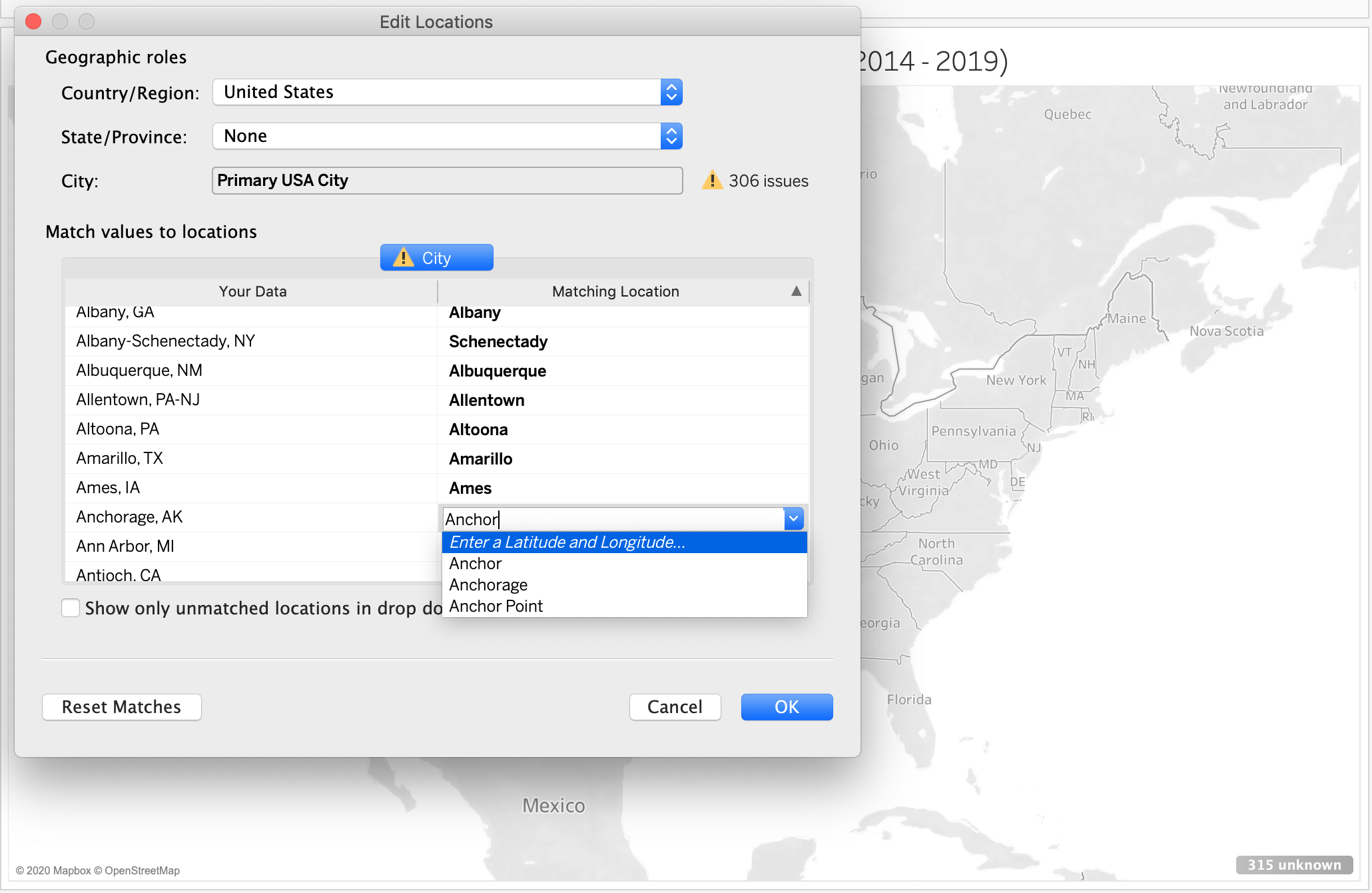
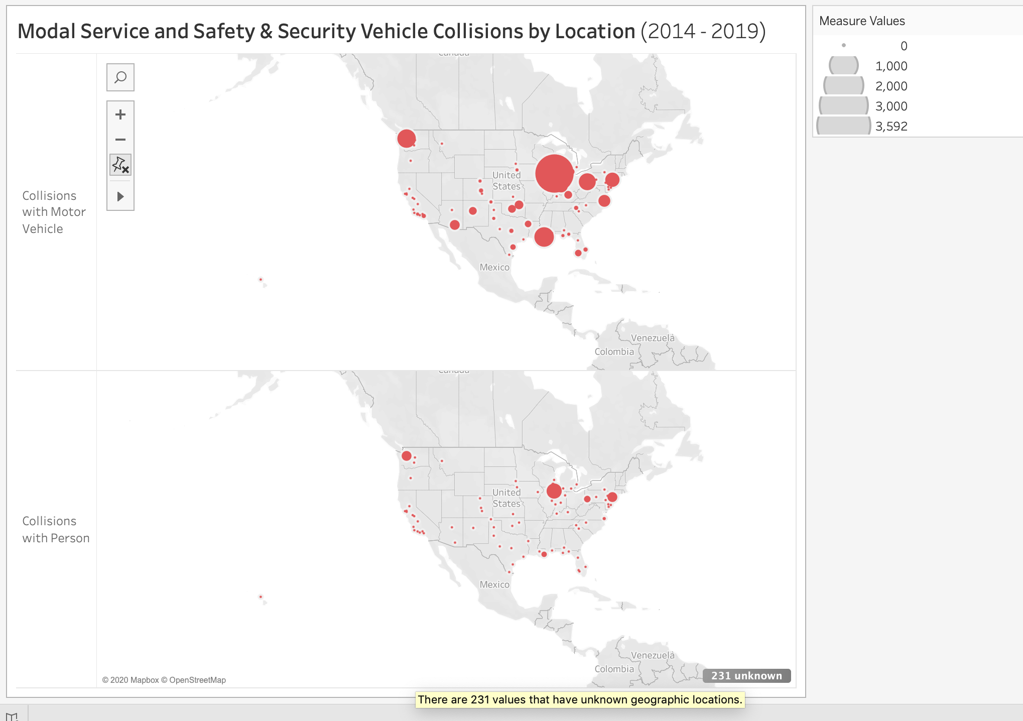
Collisions by Location
This allowed Tableau to recognize the geocodes automatically, and permitted me to plot the values onto a geographical map. However, there are still 231 unknown locations that would need manual intervention. With this graph, you can easily see comparisons between the most number of variables, including location. The main sacrifice with this visual is that the differences between years in the time series are lost.