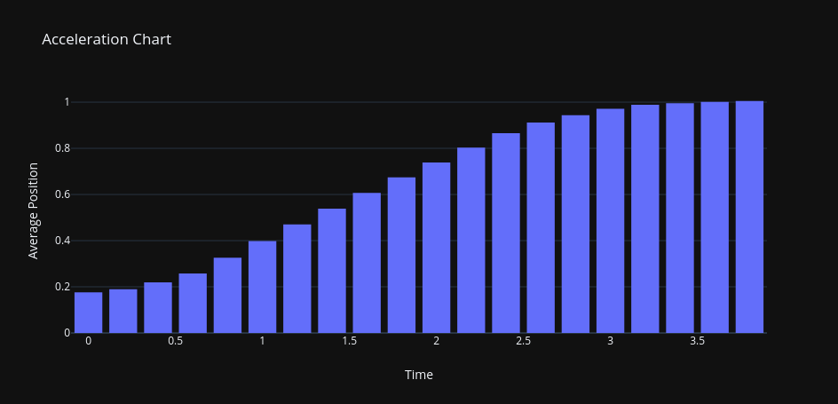
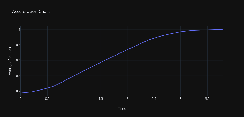
These visuals are based on the provided acceleration data set for the assignment:
          Average Position	Time
  1       0.1762677	          0
  2       0.189679	        0.2
  3       0.2196229	        0.4
  4       0.2581761	        0.6
  5       0.3255756	        0.8
  6       0.3983259	          1
  7       0.4699786	        1.2
  8       0.5387844	        1.4
  9       0.6070757	        1.6
  10      0.6739264	        1.8
  11      0.7389249	          2
  12      0.8032374	        2.2
  13      0.8660064	        2.4
  14      0.9114196	        2.6
  15      0.9437645	        2.8
  16      0.9714103	          3
  17      0.9888347	        3.2
  18      0.9953517	        3.4
  19      1.0011484	        3.6
  20      1.0050586	        3.8
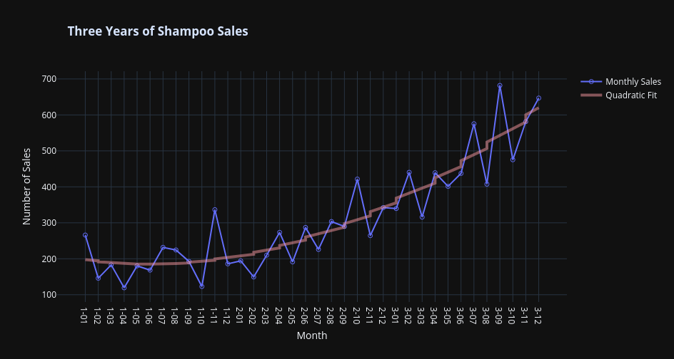
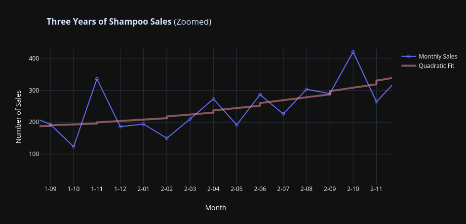
The assignment called to use Plot.ly to visualize this data and capture the design element of Part to Whole.
The overall
Bar Graph
This visual is a simple bar graph displaying progression of average position over time.
Line Graph
This visual also compares average position over time.
These visuals provide a simple representation of the obvious positive trend, however, the data does not easily lend itself to the "Part to Whole" element because of its simplicity. To remedy this, I have included similar Plot.ly visualizations for a dataset from MachineLearningMastery.com that involves shampoo sales.